
Working with sizes
Can we support grid based layout?
The basis for resizing the image is the settings for width and height. But there are many ways of creating these values.
Lets review some examples where we use alternate ways of calculating the dimension of the image. Lets check on predefined sizes, support for grid based layout and create sizes using aspect ratio.
#Predefined sizes
There are a set of predefined sizes available in img_config.php. These are based on a grid of 24 columns where each column is 30px wide and a gutter of 10px between each column. The predefined sizes are named c1 to c24 and corresponds to the width of the columns in the grid. It can be useful to specify the image width based on predefined sizes, if you ever want to change the grid, or the size of the main article column or the sidebar column, then you have only one place to change the image size. This might be time saver when working on websites changing their layout.
| What | Parameters | The image |
|---|---|---|
One column, c1, 30px wide. |
?w=c1&h=150&crop-to-fit |
 |
Two columns width, c2, 30px * 2 + 10px = 70px wide. |
?w=c2&h=150&crop-to-fit |
 |
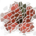
Three columns, c3, 30px * 3 + 10px * 2 = 110px wide. |
?w=c3&h=150&crop-to-fit |
 |
You can specify your own constants and map them to a size. You do this by editing the configuration file.
#Calculate dimensions using aspect ratio
You can use aspect ratio to create images that has a well defined relation between width and height. Specify width, or height, together with aspect ratio and the other dimension will be calculated. If you omit both width and height, but specify aspect ratio, the resulting dimensions is based on the original dimensions.
The resulting dimensions specify a box for the image, which any resulting image dimension will not overflow, you need to use stretch, crop-to-fit or fill-to-fit to make the image fit into the box.
Here are some examples on how to use aspect ratio.
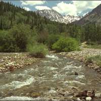
#Aspect ratio on landscape image
| Aspect ratio, parameters | The image |
|---|---|
16:10&w=300&crop-to-fit&aspect-ratio=16:10 |
 |
3:1&w=300&crop-to-fit&aspect-ratio=3:1 |
 |
The aspect ratio can be a float, for example &aspect-ratio=1.6 or any of the predefined aspect ratios in img_config.php, as of this writing it includes 3:1, 3:2, 4:3, 8:5, 16:10, 16:9 and golden (for the golden ratio).
The aspect ratio can be inverted by prepending an exclamation mark ! to the value. This can be useful when working with portrait images.
#Inverted aspect ratio on portrait image
| What, parameters | The image |
|---|---|
!16:10&h=200&crop-to-fit&aspect-ratio=!16:10 |
 |
!3:1&h=200&crop-to-fit&aspect-ratio=!3:1 |
 |
Aspect ratio can be a good way to make all images the same size, or at least, having the same aspect ratio.
#Device pixel ratio
When working with devices having a higher device pixel rate, one could decide to send a larger image to such devices. The option device-pixel-rate, dpr is a shortcut to enlarge the image dimensions.
Lets see two examples using the options &w=200&h=200&.
dpr=1 |
dpr=2 |
|---|---|
 |
 |
You see that the option dpr=2 simply enlarges both width and height with the selected factor.
#Configure size constants
This section in img_config.php allows to configure your own size constants.
/**
 * Predefined size constants.
 *
 * These can be used together with &width or &height to create a constant value
 * for a width or height where can be changed in one place.
 * Useful when your site changes its layout or if you have a grid to fit images into.
 *
 * Example:
 *  &width=w1  // results in width=613
 *  &width=c2  // results in spanning two columns with a gutter, 30*2+10=70
 *  &width=c24 // results in spanning whole grid 24*30+((24-1)*10)=950
 *
 * Default values.
 *  size_constant: As specified by the function below.
 */
/*
'size_constant' => function () {
    // Set sizes to map constant to value, easier to use with width or height
    $sizes = array(
      'w1' => 613,
      'w2' => 630,
    );
    // Add grid column width, useful for use as predefined size for width (or height).
    $gridColumnWidth = 30;
    $gridGutterWidth = 10;
    $gridColumns     = 24;
    for ($i = 1; $i <= $gridColumns; $i++) {
        $sizes['c' . $i] = ($gridColumnWidth + $gridGutterWidth) * $i - $gridGutterWidth;
    }
    return $sizes;
},*/
Using size constants can make you better prepared for changing requirements on your website, for example when the page layout changes.
#Configure aspect ratio constants
This section in img_config.php allows to configure your own constants for aspect ratio.
/**
 * Predefined aspect ratios.
 *
 * Default values.
 *  aspect_ratio_constant: As the function below.
 */
/*'aspect_ratio_constant' => function () {
    return array(
        '3:1'   => 3/1,
        '3:2'   => 3/2,
        '4:3'   => 4/3,
        '8:5'   => 8/5,
        '16:10' => 16/10,
        '16:9'  => 16/9,
        'golden' => 1.618,
    );
},*/
Using these constants can be a tool to make your images have the same relation on width and height all through your website.