
Resize strategies
This is how you can resize an image using width, height and different resize strategies.
#Resize using constraints on max dimensions
Create a custom version of the image by applying constraints on width and height, or one of them.
First lets look at a image with landscape orientation, scaled to width and/or height matching 150px.
&width=150 |
&height=150 |
&w=150&h=150 |
|---|---|---|
 |
 |
 |
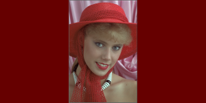
Then we use the same settings on an image with portrait orientation.
&width=150 |
&height=150 |
&w=150&h=150 |
|---|---|---|
 |
 |
 |
Now, lets consider how it works.
By setting width, height or both, the image gets resized to be not larger than the defined dimensions and keeping its original aspect ratio.
Think of the constraints as a imaginary box where the image should fit. With width=150 and height=150 the box would have the dimension of 150x150px.
This box is 150x150 pixels.
A landscape image would fit in that box and its width would be 150px and its height depending on the aspect ratio, but for sure less than 150px.
kodim13.png?w=150&h=150

The width is 150 pixels and the height is less than 150 pixels due to landscape image keeping its aspect ratio.
A portrait image would fit with a height of 150px and the width depending on the aspect ratio, but surely less than 150px.
kodim04.png?w=150&h=150

The height is 150 pixels and the width is less than 150 pixels due to portrait image keeping its aspect ratio.
So, the important thing to remember is, when using both width and height constraint, an imaginary box is created and all parts of the image fits in that box.
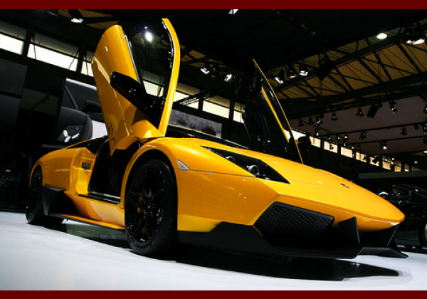
#Resize to fit a certain dimension (landscape)
Creating an image with a certain dimension of width and height, usually involves stretching or cropping the image to fit in the selected dimensions. Here is how you create an image that has the exact dimensions of 300x150 pixels, by either stretching, cropping or fill to fit.
First, here is the image resized using both width & height but without any resizing strategy. The box has a width and height of 300x150 pixels.
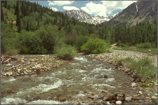
The resized image fits in the box with a height of 150px and a width of less than 300px, just as we learned in the previous chapter.
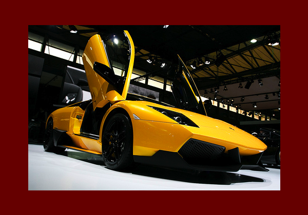
Now lets see the same example using the different resize strategies.
| What | The image |
|---|---|
Original. The original image resized with a max width and max height.?w=300&h=150 |
|
Stretch. Stretch the image so that the resulting image has the defined width and height.?w=300&h=150&stretch |
 |
Crop to fit. Keep the aspect ratio and crop out the parts of the image that does not fit.?w=300&h=150&crop-to-fit |
 |
Fill to fit. Keep the aspect ratio and fill then blank space with a background color.?w=300&h=150&fill-to-fit=006600 |
 |
Stretching might work, like in the above example where you can not really notice that the image is stretched. But usually, stretching is not that a good option since it distorts the ratio. Stretching a face may not turn out particularly well.
Fill to fit is useful when you have some image that must fit in a certain dimension and stretching nor cropping can do it. Carefully choose the background color to make a good resulting image. Choose the same background color as your website and no one will even notice.
#Resize to fit a certain dimension (portrait)
Lets take the same example on the portrait image.

| What | The image |
|---|---|
Original. The original image resized with a max width and max height.?w=300&h=150 |
|
Stretch. Stretch the image so that the resulting image has the defined width and height.?w=300&h=150&stretch |
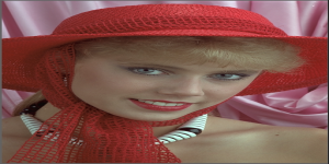 |
Crop to fit. Keep the aspect ratio and crop the parts of the image that does not fit.?w=300&h=150&crop-to-fit |
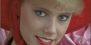 |
Fill to fit. Keep the aspect ratio and fit the whole image in the dimension, fill out the remaining parts with a background color.?w=300&h=150&fill-to-fit=66000 |
 |
As one can see - stretching an image is not always a good solution. Here its quite obvious that the crop-to-fit option makes the “best” image.
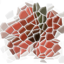
#Do not upscale smaller images
The option no-upscale prevents smaller images from being upscaled. Consider the following image.

Lets use this image with fill-to-fit using a background-color and without no-upscale.
Now the same image with no-upscale.
The image is not upscaled and keeps it original size.
This is good for images that you really do not want to be upscaled. You can set the proper background color, perhaps to match the background color of your website.